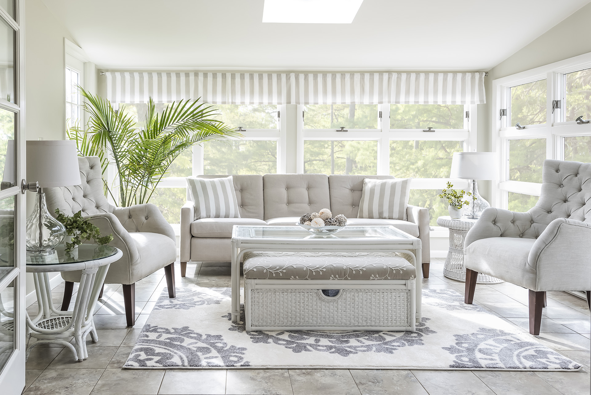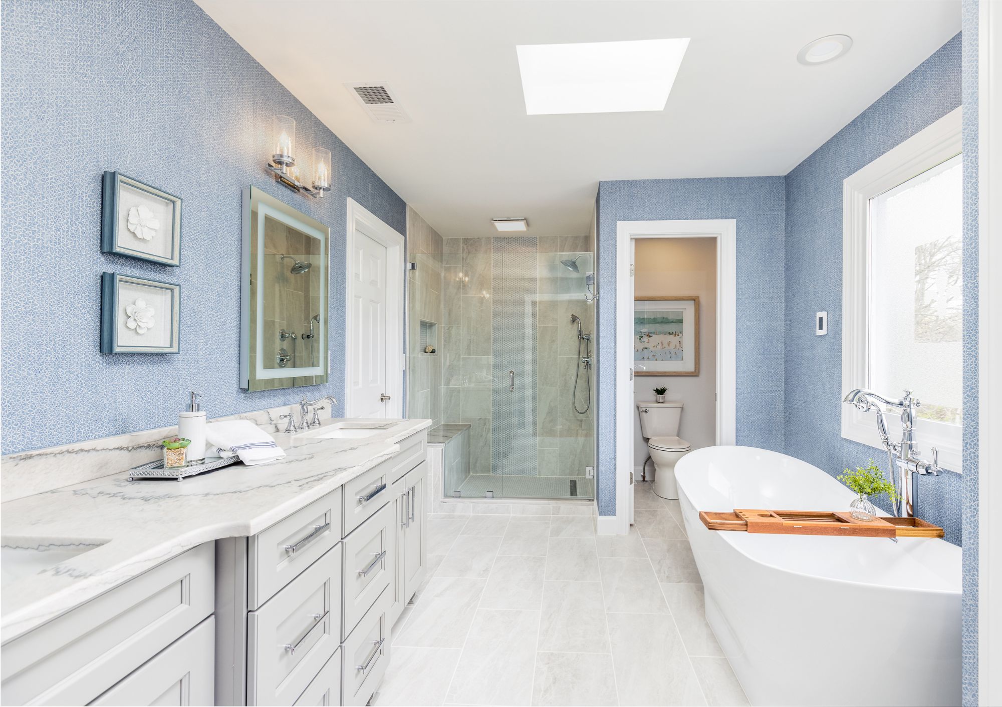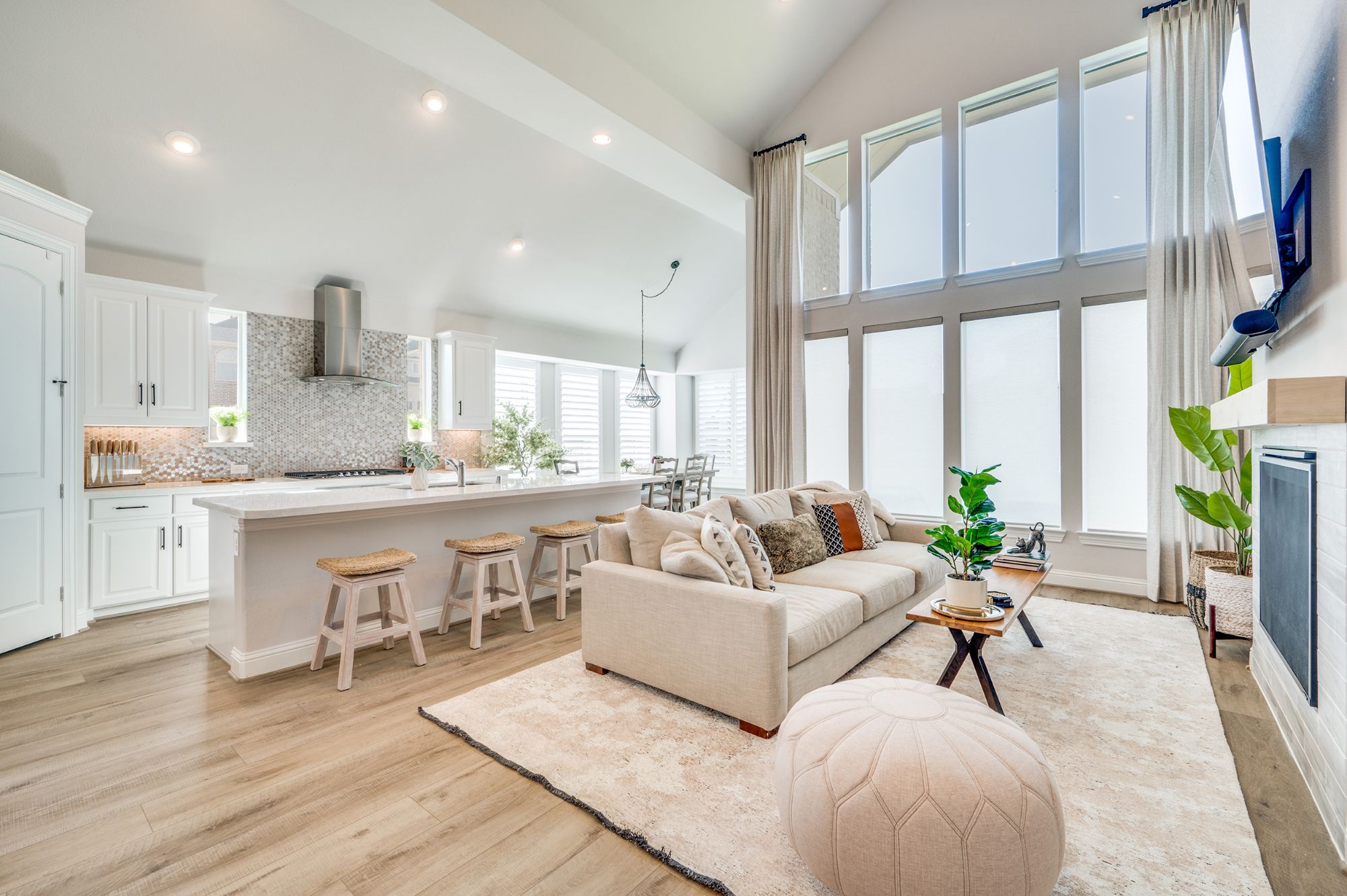
Many decorators recommend color continuity throughout a house. However, this doesn’t mean using the same color scheme in every room – how boring would that be! It does, however, mean a smooth color transition from one room to the next.
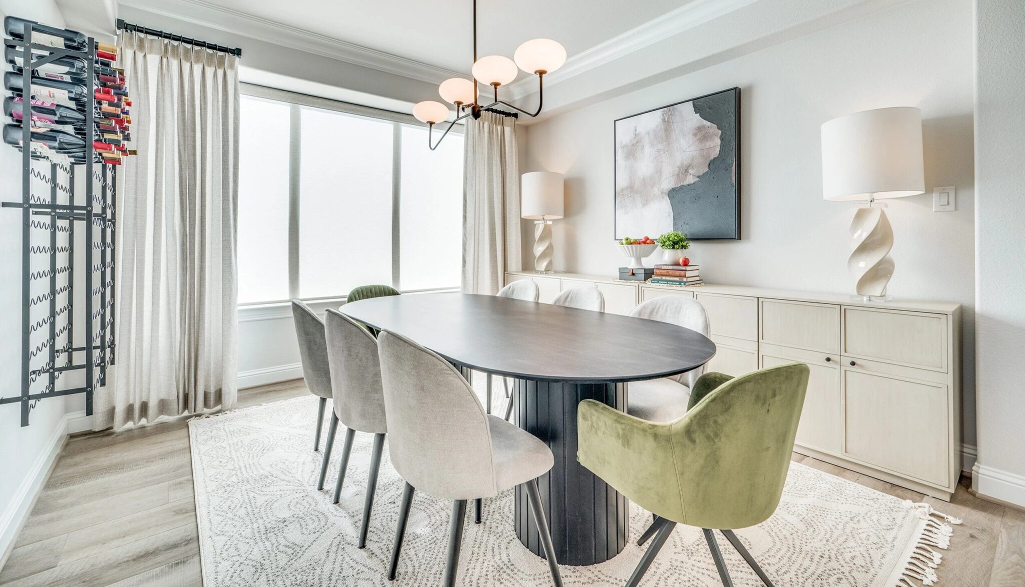
One connecting color will serve to accomplish this. It could be a soft sage green shade – or robin’s egg blue – or buttercup yellow – any color actually. The key is to use your connecting color in varying degrees of intensity from room to room. Sometimes your main color in one room would then be better used as an accent color in an adjoining room. It might be carpeting in one room; walls in another; an occasional chair in a third; an element in the drapery fabric in a fourth.
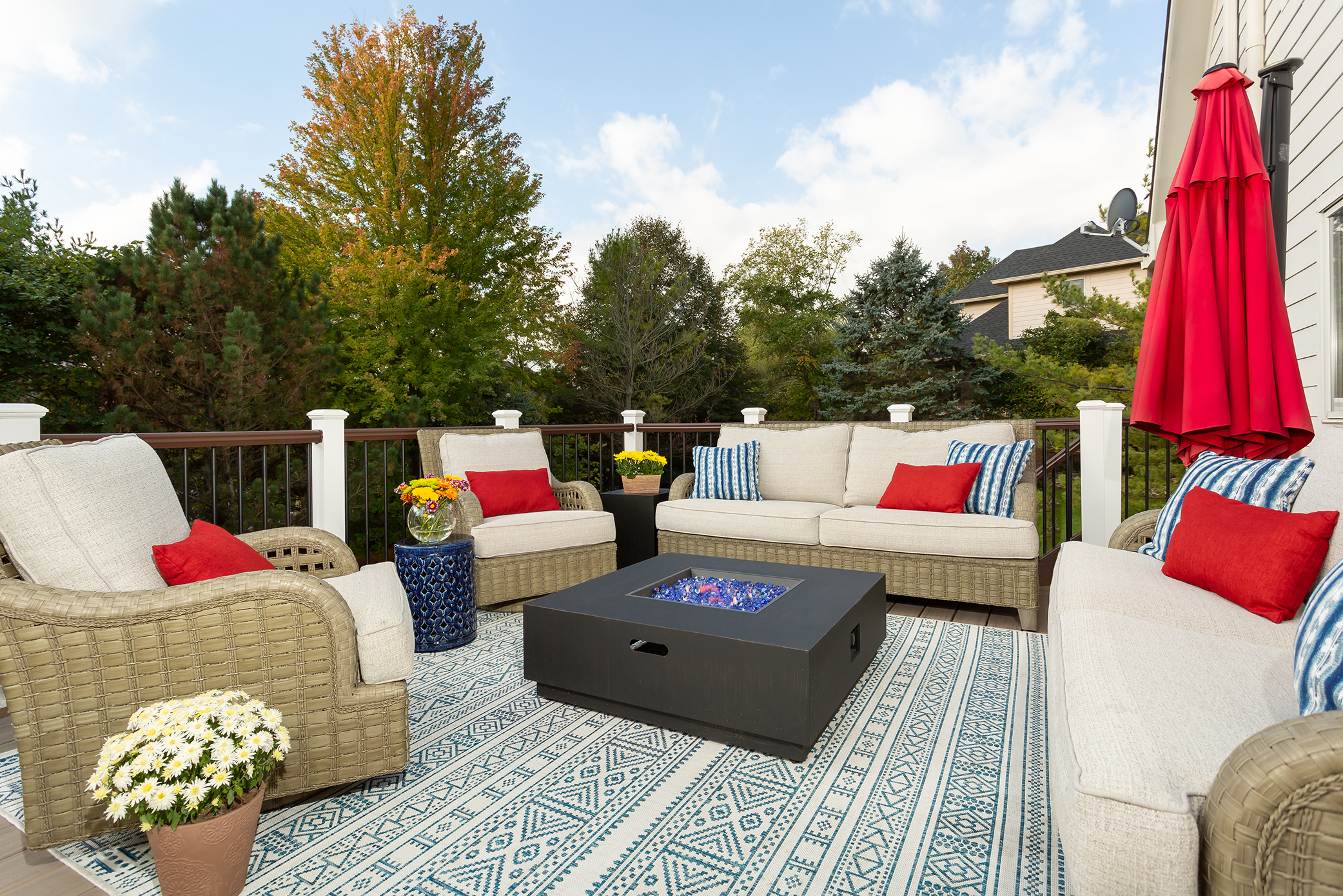
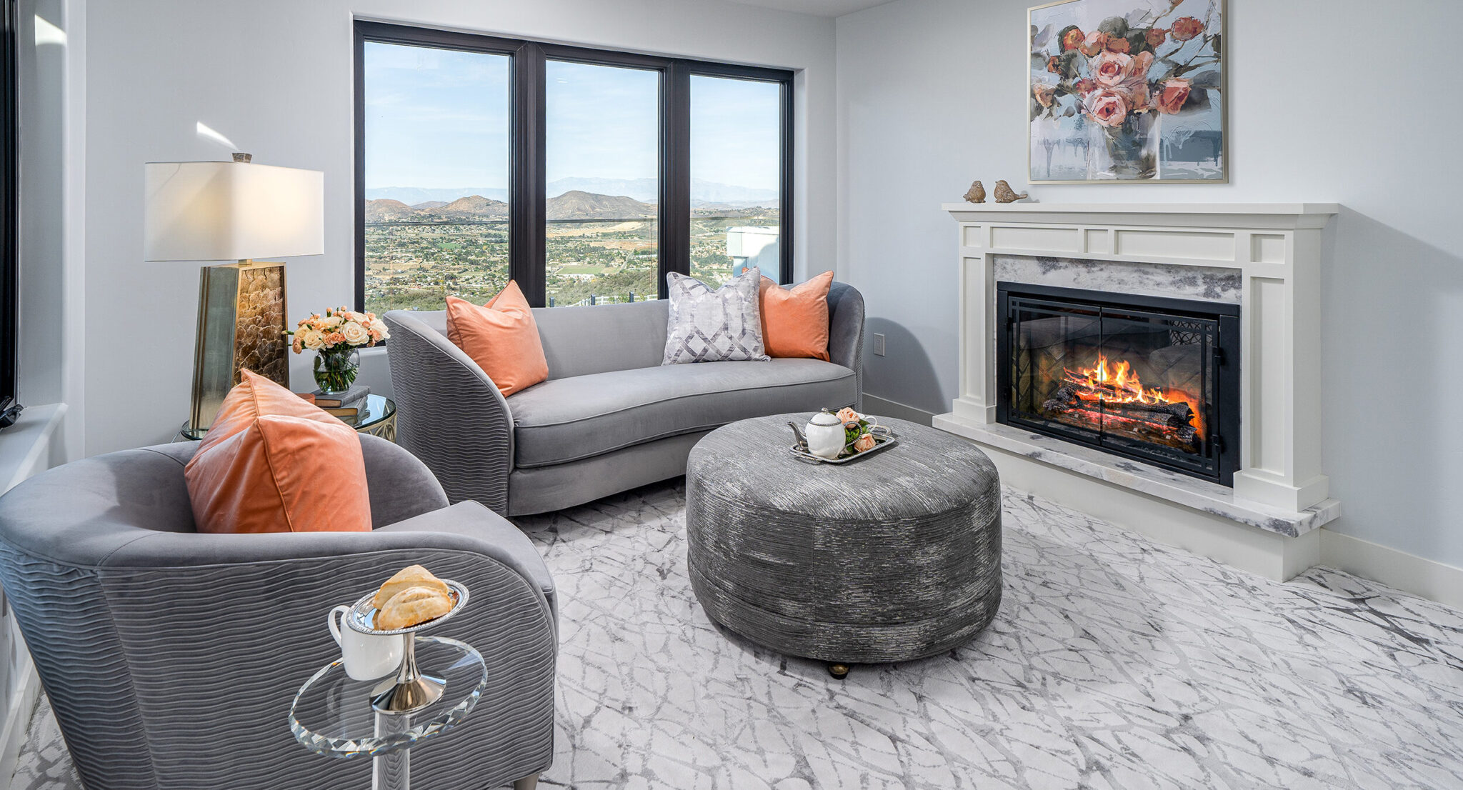
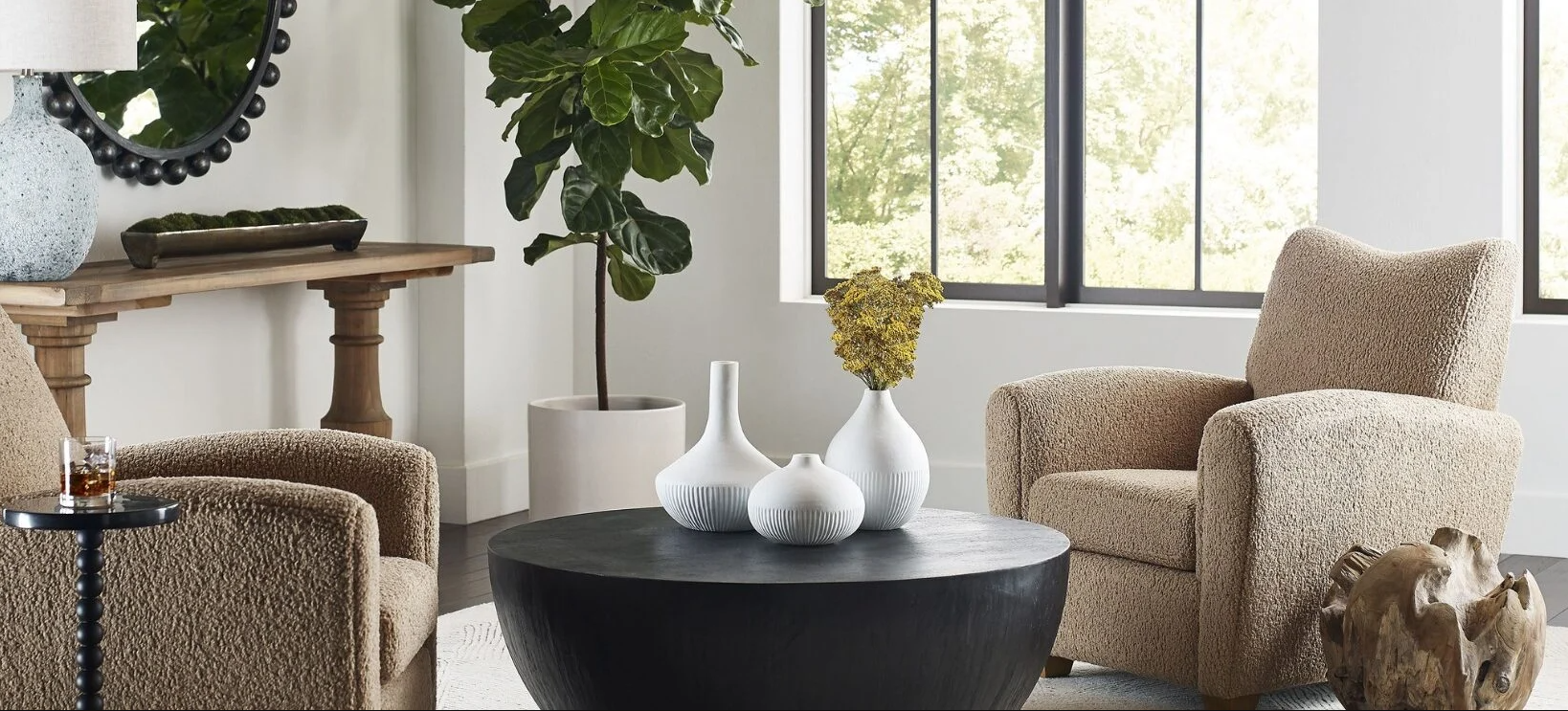
It’s also extremely important to add one unexpected fun, splash color into your basic color scheme. Did you know that when we walk into any room, our eyes crave visual movement? And by adding a splash color – something unexpected into your overall color scheme, you instantly add visual interest into your design plan!
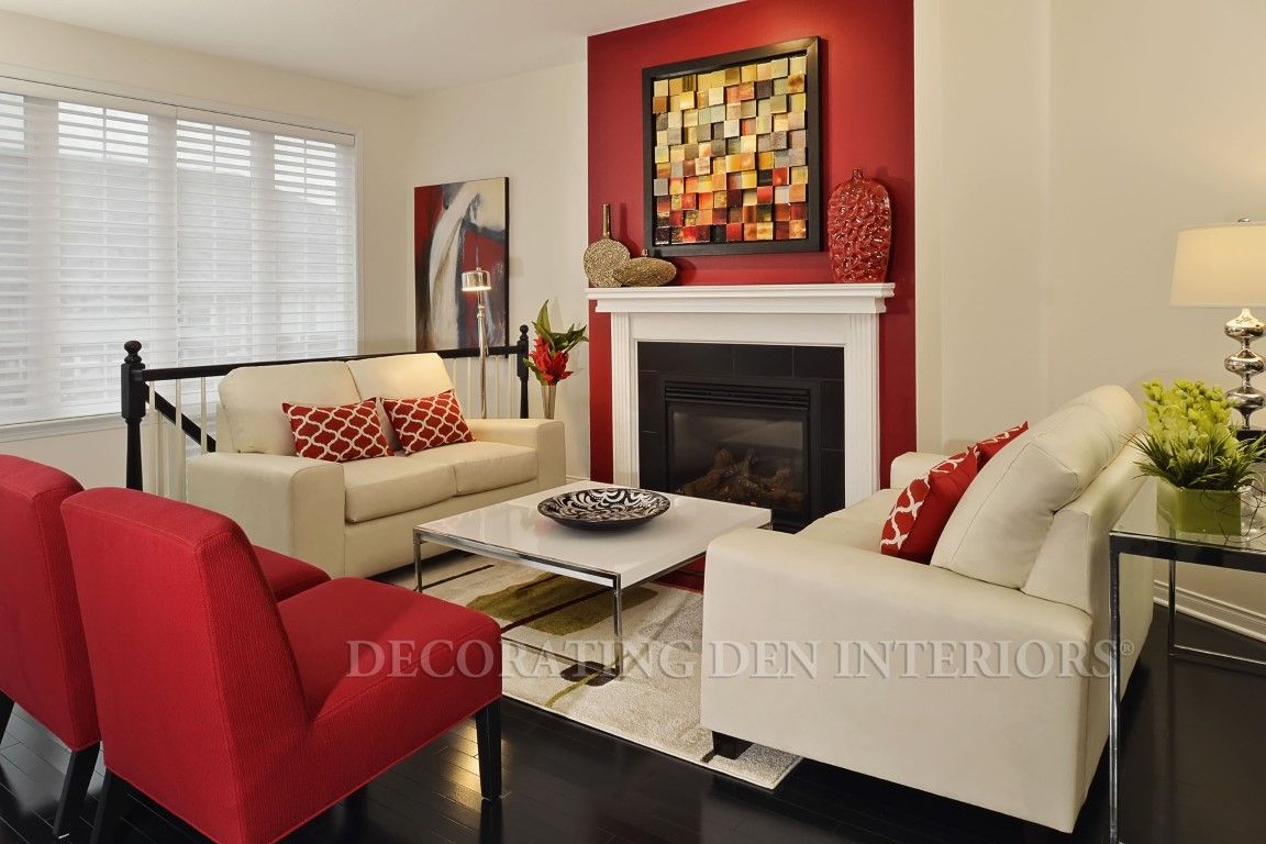
Think about a basic color scheme of buttercup yellow, sage greens, and warm winter whites. Most would find this a calming color palette, and can easily visualize carrying varying degrees of intensity of these colors from room to room. But just think about the awesome impact a splash color could add! How about introducing a warm coral shade into this color scheme. By cleverly using this color in accent or accessory pieces, and then moving these colored accents strategically around your room – you’ve immediately created a much more pleasing design plan, full of impact and visual interest!
And if you love to rearrange your furniture – just think of the possibilities color continuity from room to room affords! All your furniture pieces, as well as your accessories can be easily interchangeable color wise room to room!